I write a post to describe how I go about writing my data analysis blogs. So, here goes! I’ve outlined my general steps and linked to my old posts to give examples of what I’m talking about.
1. Identify a question
I try to think about my life and the world around me. Are there are any patterns I’d like to investigate or phenomena I’d like to quantify?
Next, I ask myself what kind of data would be helpful to answering your question. This brings us to the next step:
2. Gather some data
Gathering data can be straightforward or quite tedious. The data might exist already,
neatly compiled in a database. If the database is public, I’m done with this step! If it’s private,
I generally send a request to the owner to use it. If the data is inside an app like Facebook, I look for ways through which
I can request a data download.
The data could also exist somewhere a bit more inconvenient (scattered around the web, for example) and I’d have to go collect it.
3. Clean the data
The data rarely comes ready to analyze. In order to get it ready, I need to “clean” it.
What does it mean for the data to not be ready to analyze? Maybe there’s a lot of data that doesn’t relate to my question. Maybe the data is represented in a really disorganized or inconsistent way.
Cleaning could mean extracting the relevant subset of the data, organizing it, and changing how it is represented to make for a more straightforward
analysis.
Data analysts lead the charge in collecting and analyzing key data points to make business decisions. How else does a company know what products they should order more of? Or how would they know which customers are dissatisfied with services? Every company needs a data analyst, which makes anyone in the field in high demand.
4. Do some data analysis!
I generally use Python to write scripts to analyze and visualize my data. I’ve put some of my code publicly on Github, so you can take a look at it. However, Python isn’t the only option.
You can also use a variety of other scripting languages that have great analysis and visualization tools.
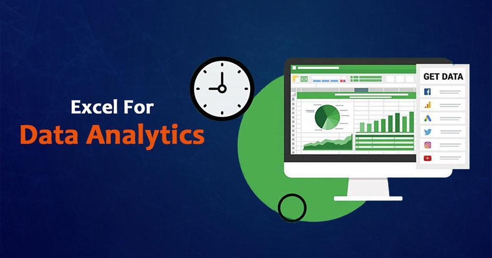
You can also go no-code and use spreadsheet functions
5. Make some plots
As I analyze the data, one useful way to spot cool patterns is to make visualizations. I can do this with a variety of graphs. My first
plot is often quite ugly. I can use various functions inside my plotting library to make it better highlight the data, both scientifically
and aesthetically.
6. Tell a story
It’s important to think about how my data analysis and visualizations can contribute to telling a story about the trend I’m investigating or phenomenon I’m quantifying. I try to make plots in a way that allows each plot to show a new
part of the story. I try to order them my plots my posts in a way that each my words and my plots together progressively tell a story
about what is going on
So, that’s pretty much how I go about writing my data analysis blogs. I separated it into 6 steps, but thinking “backwards” rather than strictly step-by-step can help make your work in previous steps more meaningful. If you think about how to make
the story compelling, you can make better visualizations. If you know what visualizations you might want to make,
you can better direct your data collection.

Comments (14)
Rafsan Mahbub
17 Aug 2021Always Great contents
ReplyOlivia
18 Sep 2021It was of great help indeed.
ReplyDavid
10 Feb 2022Great tips!
ReplySophia
13 Mar 2022I would simply say that you are amazing
Reply